


In data-informed investigations, storytelling is a way to organise and transmit information.
However, stories are selective by design. At the end of an investigation, a dataset is able to tell, and therefore amplify, some stories and not others. Even a well-written methodology is a partial story of the decisions made during the investigation: why certain things, events or people are reproduced in the dataset, and others not.
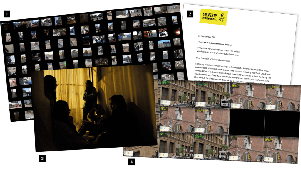
As members of Amnesty’s Digital Verification Corps (DVC), we conduct open source investigations into alleged human rights abuses. Central to this work is building datasets, and we regularly find ourselves cleaning and analysing hundred-row spreadsheets. The data could be records of the use of rubber bullets at protests, or drift-backs in the Aegean Sea.
What follows is a reflection on this quantitative approach to human rights work, inspired by ‘Data Storytelling for Justice’, a workshop led by Sophie Dyer at the 2022 DVC Summit. We will focus on the risks and opportunities of mobilising data in research and advocacy to tell impactful stories.
Data is not ‘neutral’
During the data production process, certain values and interests get reproduced and amplified, while others are not. In What Would a Feminist Open Source Investigation Look Like?, Sophie Dyer and Gabi Ivens, the head of open source research at Human Rights Watch, emphasise the role of the researcher, reminding us that:
“All research is situated within a community of practice that has its own ‘axiology (morals, values, and ethics)‘. It helps to think of investigations as a string of decisions that enact these morals, values, and ethics. Seemingly innocuous, technical decisions such as ‘acts of tagging, indexing, aggregating and defining of data and data categories are inherently political‘, write members of Syrian Archive.”
For these reasons, and despite our tendency to trust numbers, the data we produce and curate is far from neutral. As investigators, we have a responsibility to identify and mitigate the biases in the datasets we work with.
This includes building an awareness of ‘missing data sets’; that is, the blank spots that exist in otherwise data-saturated environments.
In 2016, Nigerian-American artist Mimi Onuoha built The Library of Missing Datasets to record these gaps in data collection that can bias our understanding of events. Onuoha’s library, which includes “trans people killed in instances of hate crime”, “employment statistics that include people who are behind bars”, and “undocumented immigrants currently incarcerated”, demonstrates that it is marginalised groups that are often impacted the most by a lack of data.
When data exists, there are a myriad of ways that it can be biased, which is to say, not be representative. Reporting, selection, group attribution, or implicit bias are typical types of preconceptions that can affect data.
As investigators, developing an understanding of our location (geographic, linguistic, socio-economic, racial, gender, age…) and the decisions we make in an investigation is a first step towards dismantling possible biases. Or, put differently, questioning whose stories the data is telling and how.
To do this work, we need a common vocabulary. Below, we outline eight key terms in data-informed research.
Core vocabulary
Data
The Data Storytelling Workbook by researchers, Anna Feigenbaum and Aria Alamalhodaei, defines data as a “value or set of values” representing a specific concept or concepts. In their definition, data becomes information when it is analysed or combined with other data, which gives it meaning and context.
By comparison, in Data Feminism, the US-based educators Catherine D’Ignazio and Lauren Klein write that data isn’t limited to numbers, but can also be words, stories, colours or sounds. It is any type of information that is systematically collected, organized and analysed.
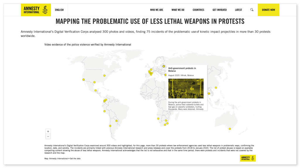
In a recent DVC project monitoring protests for human rights violations, our data sources were images and videos downloaded from social media and news articles. Other data-informed investigations by Amnesty International have begun with troves of corporate records or even Google Street View imagery.
Critically, both definitions of data describe how each unit of information or data point means little on its own. However, it takes on meaning when it is combined with other data.
Selection criteria
When building a dataset, you are deciding what is important. This is your selection criteria or scope, and it will delimit what or who gets represented in the research.
In the words of D’Ignazio and Klein, “What is counted—like being a man or a woman—often becomes the basis for policymaking and resource allocation. By contrast, what is not counted—like being nonbinary—becomes invisible (although there are also good reasons for being invisible in some contexts.”
Having an awareness of your selection criteria will help you mitigate or account for bias in the early stages of an investigation.
Attributes, variables and values
Attributes are a characteristic or feature that is measured for each observation.
Attributes can have multiple values, called variables.
| Attribute | Variable |
| Fruit name | Banana, Apple, Papaya, … |
| Fruit colour | Yellow, Orange, Purple, Green, Red, … |
| Has plastic packaging | True, False |
| Count of fruits | 378 |
| Count of bananas per bunch | 5, 7, 11, 7, … |

A strength of quantitative research is that it can scale more easily than qualitative approaches, making large-scale analyses possible. However, reducing a person or event to a set of attributes can flatten individual differences.
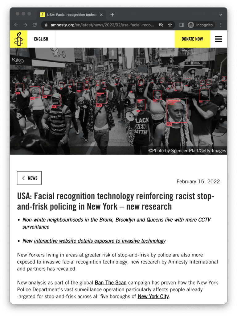
For example, we can use data to prove that non-white neighbourhoods in the Bronx, Brooklyn and Queens live with more CCTV surveillance than white neighbourhoods. The research behind this finding combined Amnesty International’s data on surveillance camera locations with US Census tract data on race. The census data allowed us to make a statement about the relationship between race and possible exposure to surveillance. However, it tells us little about the diversity of experiences that brown and Black New Yorkers have of being surveilled.
Likewise, a quantitative approach renders invisible characteristics that are not accounted for. For example, a survey that asks respondents to choose between “male” or “female” will not record the existence of other gender identities.
Be open about the limits of your data and, when appropriate, use a complementary, qualitative research method, such as interviews to capture individual experiences that resist easy quantification.
Outliers
An outlier is a data point that diverges significantly from other observations.
Outliers can disrupt analysis, but before minimising or discarding them you should carefully consider the consequences: in some cases, to remove an ‘anomalous’ data point may erase an important story, albeit one that is not representative of the dataset as a whole.
Métis geographer Max Liboiron runs an anti-colonial, feminist, marine science lab in Canada. In her book, Pollution is Colonialism, Liboiron expresses her regret about a study where she dismissed a seabird that had ingested an anomalously large amount of ocean plastic as an ‘outlier’. Liboiron speculates about the bird’s life and death: what led it to consume so much more plastic than the rest of her flock?

Data provenance
Record and share the provenance of your data. This means documenting where a data point comes from, as well as the processes and methodology that produced it.
This can avoid situations where your dataset is misused or misunderstood.
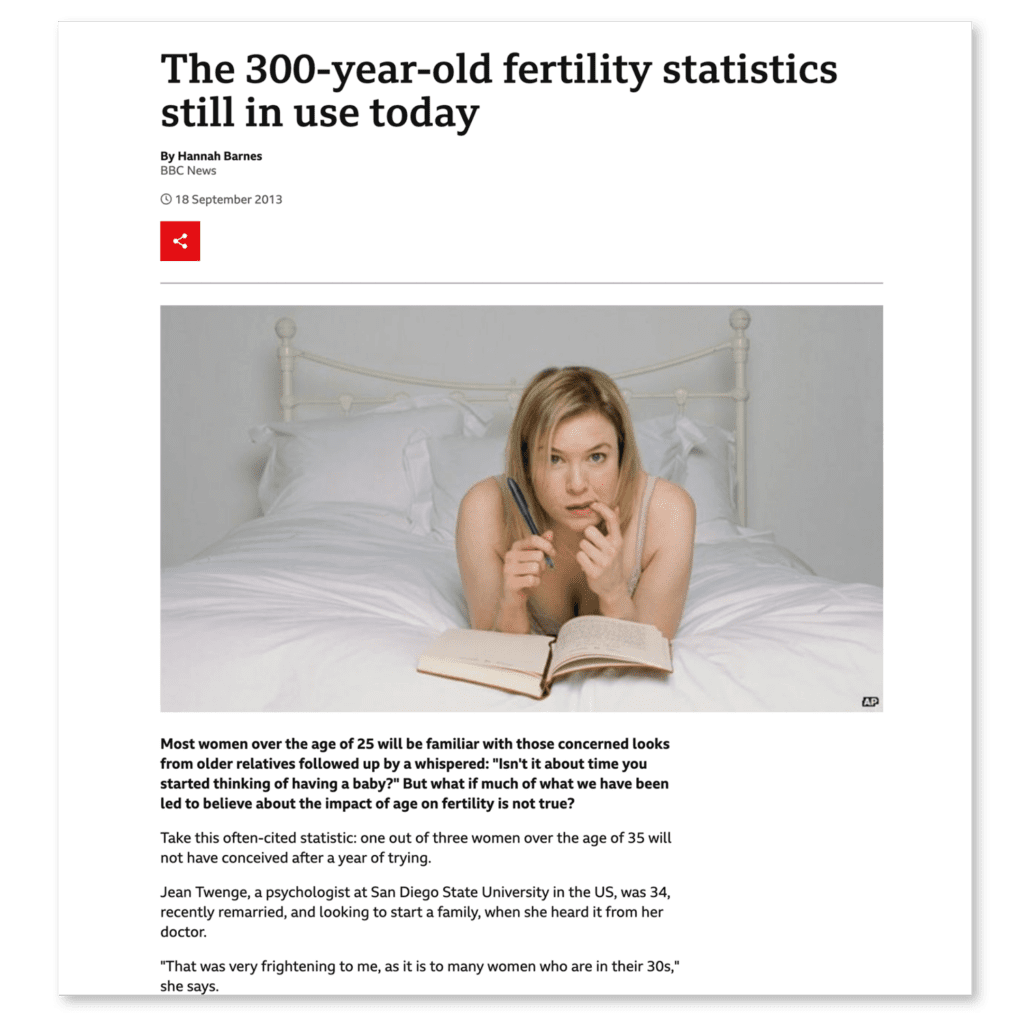
A notorious example of this is the pop statistic that “one in three women over 35 will not have conceived after a year of trying”, which was revealed to be based on a study from 2004 which used French birth records from the seventeenth and eighteenth centuries, before electricity or modern healthcare.
Captioning
How you choose to narrate your findings or caption your data visualisation is a critical last step: the wording must be clear, include nuances or caveats and, for advocacy and campaigning purposes, be compelling. To this end, captions can be used to reinforce the real-world context of the data and amplify the story in the data that you think matters the most.
Don’t be put off, sometimes simple is best
You don’t need to be a statistician to do data-informed research. Instead, it’s about finding and refining your question and interviewing your data as you would a human source.
Use “the right depth of tech” is the advice of Amnesty International collaborator and data scientist, Julien Cornebise. The investigation, Decode Surveillance NYC, used thousands of digital volunteers to map and categorise surveillance cameras at traffic intersections across New York City. Each traffic intersection was analysed by three volunteers. After exploring various complex mathematical models, Cornebise and the team arrived at the conclusion that it was safe and effective to use the median value. The median is found by ordering all data points and picking the one in the middle: school-level maths!
Resources
Tools
Datawrapper
datawrapper.de
Mapbox Impact Tools
mapbox.com/impact-tools
Flourish
Flourish.studio
Reading list
Data Storytelling Workbook
2020, Anna Feigenbaum and Aria Alamalhodaei
Data Feminism
2020, Catherine D’Ignazio and Lauren Klein
Design Justice: Community-Led Practices to Build the Worlds We Need
2020, Sasha Costanza-Chock
Pollution is Colonialism
2021, Max Liboiron
Illustrations from the talk and workshop “Data Storytelling for Justice” by Sophie Dyer at the 2022 DVC Summit in Mexico City.